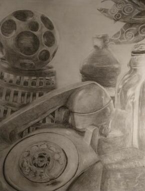
Still life pencil drawing:
1. Describe how you arranged your composition. Discuss your use of elements and principles. Is it a successful composition?
I arranged my composition with different proportions and value. I mixed together light and dark objects together. I had taller objects in the back and shorter objects in the front. I showed proportion by making the objects in the front bigger than those in the back. This helped create depth and made my composition look realistic.
2. Did you use a wide range of values? (A range from white to black with at least 9 values). Explain how this is evident?
Yes, I used a wide range of values of pencil from white to black. I lightly shaded for where the light was hitting the most on the objects and I shaded darker for where there were shadows and the light wasn't hitting it as much. I showed that the light source was coming from the left and the objects on the left were in the line of the light. I also showed that on the top of every object that it was lighter and it illuminated.
3. Explain how your knowledge and creating practice studies with value contributed to your piece.
I used my knowledge to create this piece from previous projects and practice studies. I remembered to lightly put pressure on the paper for where it was lighter and add more pressure in the darker areas. With the practice studies it helped me remember and practice control with the pencil onto the paper.
4. Describe the blending and transitions in your objects (discuss your use of pressure with pencil and other techniques to achieve this).
As I shaded and created different values I used my blending stump to blend the values together and make it more smooth looking instead of seeing the pencil strokes. In the lighter areas I lightly put pressure on the pencil and in the darker areas I applied more pressure.
5. Explain how your interpretation of texture is essential in capturing the look of the object.
Texture is essential into capturing the look of the object because it helps create a feeling for how it feels when you look at the composition and it also helps create depth. In my composition, as I added value to the telephone I blended the values together to show that it had a smooth surface. In the plastic bottle I added more highlights to show that is was a clear object and give it a glass effect.
6. If you could recreate your pieces what would you do differently to enhance to final outcome?
If I could recreate this piece I would add a grid onto my paper because as I first sketched it, it was a little unproportional and a grid will help that. Also I could get at a better angle with a little bit of less negative space or I could add another object in the background.
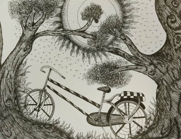
Pen and Ink:
1. Describe how you arranged your composition. Discuss your use of the elements and principles. Is it a successful composition?
I decided to make my piece showing a tree wrapping around a bicycle. I had grass growing up on the tree showing that the bike was still on the ground.I think this is a successful composition because I included different textures, patterns and showed value changes.
2. How is texture and pattern important in your composition?
Texture and pattern is important in my composition because it creates a feeling for how things feel when you look at it and to help give it value. Without it just like value it would look flat and boring and no one would like to look at that. It also helps define the composition.
3. Why is value so important in this project?
Value is so important in this project because using pen it is just one color, black and you have value or else your whole composition will look flat. Value helps create depth and perspective in your piece. Without it, it looks plain and boring.
4. Describe your craftsmanship (How well the project is crafted technically).
My craftsmanship would be described as me constantly practicing the mini assignments and learning techniques on how to use pen and ink. For me to understand and get the different techniques given I have to keep practicing to get better. Once I master the practice drawings I use my knowledge and apply it to my project.
5. Explain how your knowledge and creating practice studies with value and pattern contributed to the success of your piece.
Using the practice studies helped me understand and gain knowledge on how to use pen and ink. I learned how to properly shade, making it look 3-d, and giving objects textures and patterns. After doing this I was able to control my pen on the project and practice some of the techniques I learned.
6. When applying the pen and ink/pattern techniques why and how is it important to make sure you understand the concepts taught in class?
It is important to understand how to use the concepts taught in class because it helps us develop as a growing artist. As we practice we gain knowledge and are able to apply to our compositions. Learning different techniques and practicing helped me get better in this area of art that I'm not mostly familiar with.
7. As a growing artist how do you think what you have learned will guide and better your future projects. Explain.
I think what I learned will help me use my my knowledge on future projects and still be able to practice the techniques I learned. I will also be able to learn new techniques because of the knowledge I already have of this area. In future projects I will get better and better than where I started.
8. If you could recreate your piece what would you do differently to enhance your final outcome?
If I could recreate my piece I would have taken my time better. I rushed a little and I would have liked if I was a little slower thinking about how I was applying my pen to the paper. I also would have rearranged my composition and patterns in it. I had a little bit of too much negative space and I would like to fill in that gap with a barn.
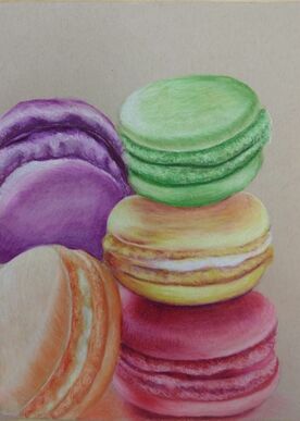
Colored Pencil cluster of objects:
1. Describe the overall composition of your artwork (balance, unity, rhythm and movement).
My overall composition is representing macaroons. I balanced the layout of where I wanted to put the macaroons. Instead of having them in right I put them more on the left than the right to give it some negative space. I had some of the macaroons lay against a stack on other macaroons to give it some movement and a rhythm.
2. How did you use value to create dimension? Is this important? Why?
I used darker shades of the same color for the darker parts of the macaroons and shadows. I used white colored pencils for the highlights and lighter parts on the macaroons. Yes, using value to create dimension is important because it creates depth and the drawing won't look so flat.
3. What did you achieve by using exaggerated color?
I achieved a colorful drawing by using exaggerated colors. Instead of having a plain and more of a one color drawing I used different colors to make my composition pop. I used different colors along with certain main colors to make it more realistic and to show colors that people wouldn't normally see right away.
4. Describe the craftsmanship of your colored pencil. (How good the project is technically crafted).
My craftsmanship for this project was constantly going through different pictures online and getting unique ideas for a cluster of objects. I had trouble choosing what I wanted to draw. I came up with a couple of composition sketches and chose the best one to make this drawing successful. I also added a lot of different tints and shades to make the macaroons dimensional and have value.
5. Were you able to achieve depth by showing a foreground, middle ground and background? Explain.
Yes, I was able to achieve depth by showing a foreground, middle ground and background. I showed this by using different values to make it 3-D and shadows to show that the macaroons weren't floating. I could have added more shadows in the background to show some more instead of having a plain background.
6. Explain your experience with colored pencil/chalk pastel. What were the obstacles and advantages?
I have used colored pencil before and have developed growth. Some obstacles I had in this project was figuring out how to color the creme filling in the macaroons and make it look realistic. I used circle motions with white to show some texture. Some advantages I had in this project was that I was already familiar with how to use colored pencils and I knew how to apply the techniques I had already learned.
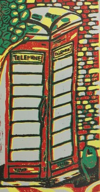
Four color prints:
1. Describe the craftsmanship of your prints. (How good the project is technically crafted).
Registration and carving: My craftsmanship for registration and carving was pretty good. This was the first time I have done printmaking so at first carving the linoleum I took more time and I was very careful. I had a lot of outlines so I had to carve inside a lot of places carefully not carving away important outlines.
Burnishing and ink coverage: My craftsmanship for burnishing and ink coverage was kind of all over the place. I kept flipping the linoleum in the wrong places making my print blurry. I also didn't add a lot of ink on the linoleum.
2. How did you use texture, color harmony and balance to define your choice of subject?
Texture: I used texture to define my choice of a telephone booth by adding different designs and outlines. Like in the trees I used wavy lines and outlined bunches of leaves in circles to show the dimension in the tree. I also used black outlines throughout the print to show structure.
Color harmony: I used color harmony to define my choice of a telephone booth by adding different colorful colors. I used colors grey, yellow, red, green, and black. I tried to balance my colors every to make my print not so one color in one area. I used complimentary colors to make it look realistic.
Balance: I used balance to define my choice of a telephone booth by adding colors all around my print and mixing up the color harmony in different places. I showed balance to make my print realistic and to show values.
3. If you could recreate your pieces what would you do differently to enhance your final outcome?
If I could recreate my pieces I would choose to have black paper so I can carve out the outlines first so it would be easier to carve out the rest of the colors. I also would better plan the brick wall colors because at the end I guessed where most of the colors would go. I also would have a little less detail, I had too much going on in the print. I would then add more ink onto the linoleum because a lot of times I didn't get good ink coverage. Lastly, I would trace my linoleum better for where I would flip it and it would better align.
Clay Food:
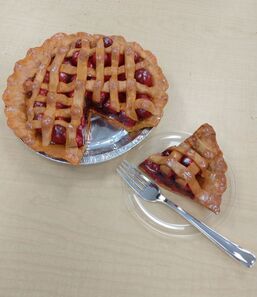
1. Describe the craftsmanship of your sculpture. (Is it neat and well executed?)
My craftsmanship for my pie sculpture would be it was well put together. As I was sculpting I thought of different techniques on how I wanted to sculpt it and make it look realistic enough to eat. I added different textures in the crust to show it was creasing together. I made many clay balls for the filling the made the pie look bigger and full.
2. What was the most difficult part of this project?
The most difficult part of this project was coming up with ideas of what I wanted to sculpt. I had many ideas but it was hard to come up with some unique ones. Another thing I found struggling was writing techniques I would use to create my piece and make it successful. Once I started sculpting I knew what I wanted to do. Also mixing the colors together to get the best realistic crust was challenging. Also the way I sculpted my pie it was challenging to try and paint in the cracks
3. Did your color choices work together harmoniously?
Yes my color choices worked together harmoniously. I used burnt sienna and yellow ocre for my crust and used red for my cherry filling. I added dark and light shades of red and yellow-brown to show value. I also used white paint for the highlights. I have smooth transitions between all the colors on my pie.
4. Is your sculpture interesting from all views?
Yes my sculpture is interesting from all views. I created depth at every angle and showed highlights and shadows. Whenever I look at it I'm always so fascinated at how the crust and the lace lays across the filling in the pie.
5. Describe the differences in constructing a sculpture and doing something 2D.
The difference between constructing a sculpture and doing something in 2D is that sculpture are 3D all around and you can see all the dimensions while 2D is on a flat surface and your making it look 3D with different tints and shades to make it have depth.
6. How did you create textures in your sculpture?
I added pinches and slabs to create texture in my sculpture. I used the needle tool to make marks in the crust to make it look realistic. I also created clay balls to show the filling. I also added some indentations in the crust to create some texture.
7. Does your sculpture look like the actual food? How did you accomplish this?
Yes my pie looks like the actual food. I accomplished this by adding highlights and shades to the colors to give it a depth feeling and to show the shadows. I also added a layer of the gloss coat primer to make my filling look more realistic and to give it a gooey look. With the pie crust I pinched it along to show the crust indentations and indented the laces to show that it was going over the filling and under the other laces.
8. What would you do differently if you were to do this project again?
If I could do this project again I would carve out all the clay inside the clay balls and with the crust I would add more texture. After cutting out my slice of pie I would go back and fix up the parts I cut of and make the edges neater. I would also go back and mix the paint with more colors to get a better pie crust color than it is now.
