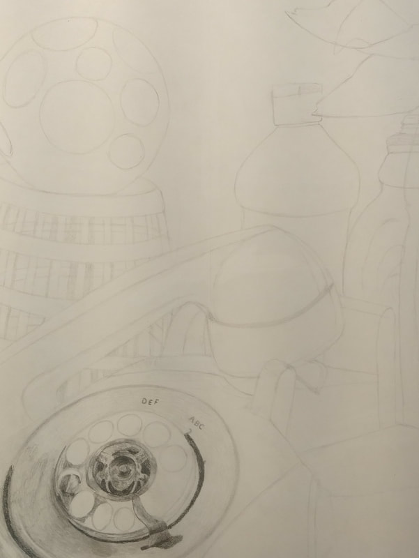
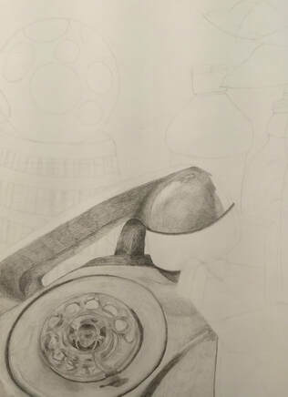
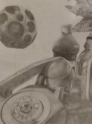
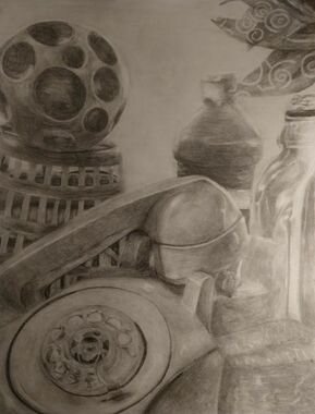
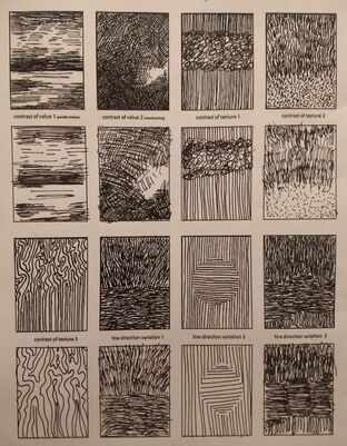
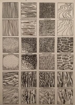
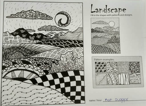
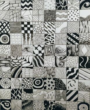
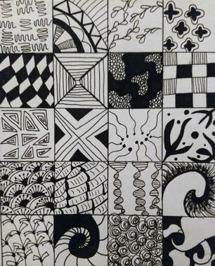
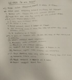
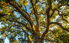
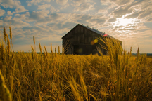
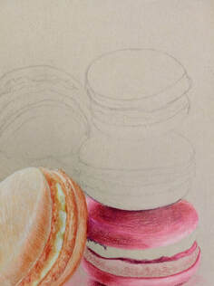
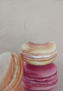
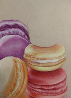
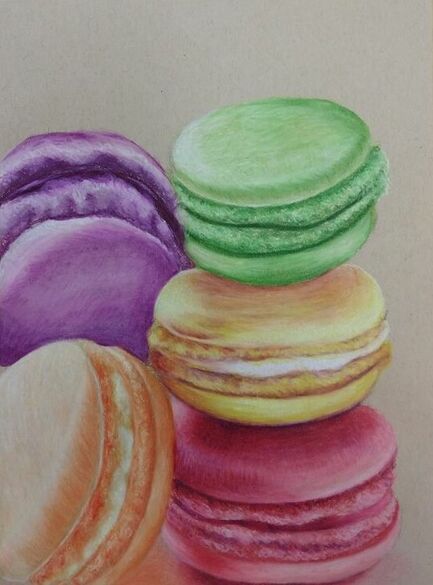
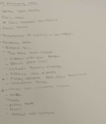
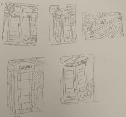
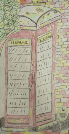
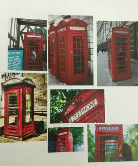
Art 2:
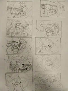
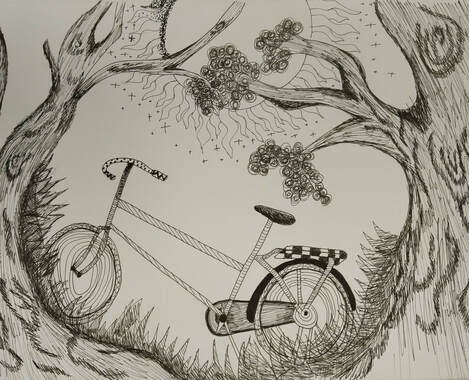
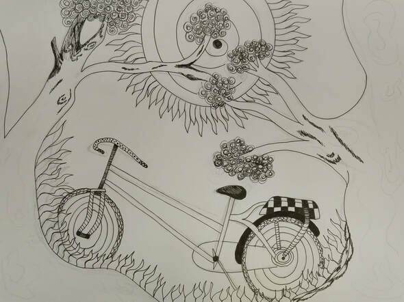
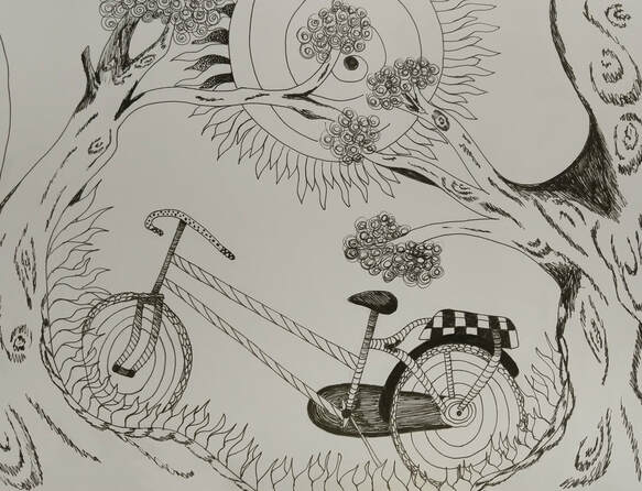
Four drawings:
|
|
|
|
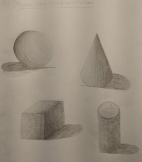
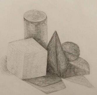
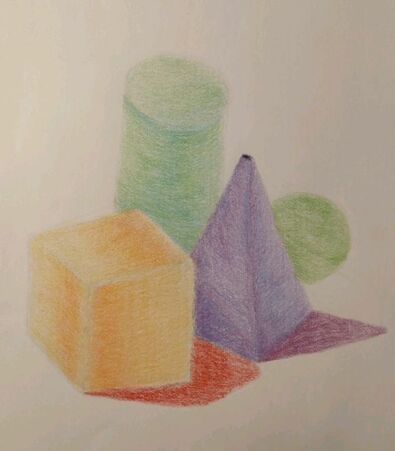
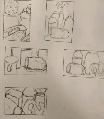
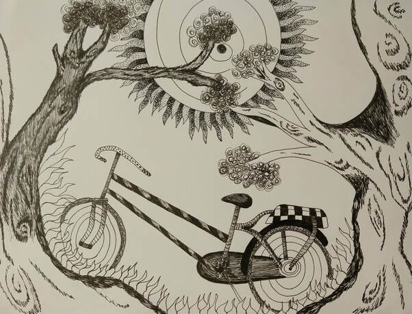
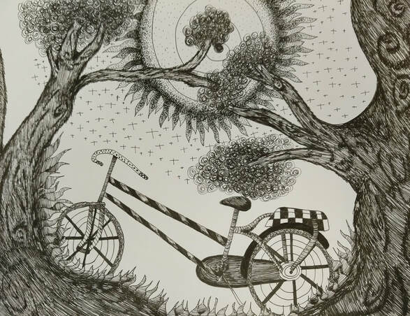
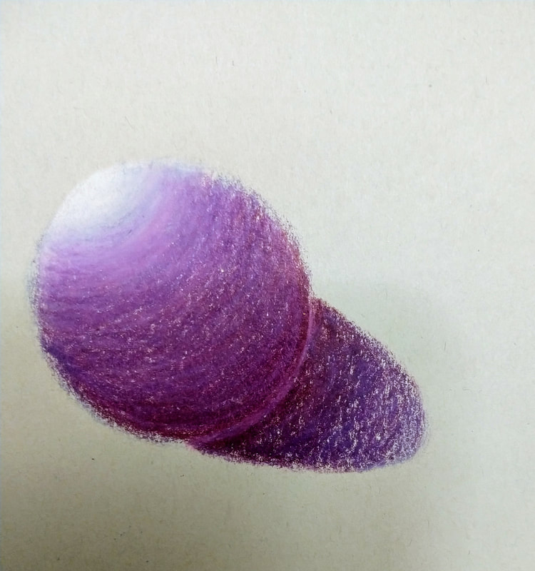
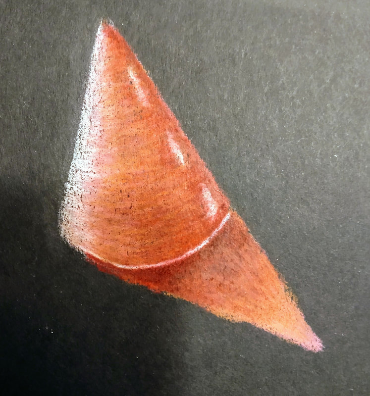
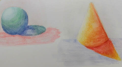
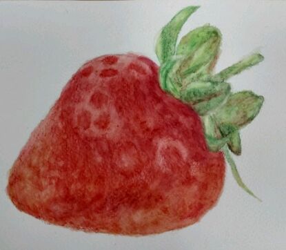
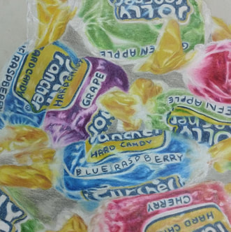
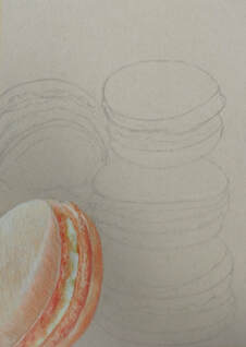
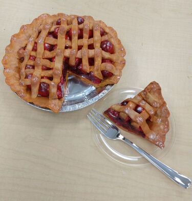
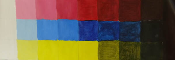
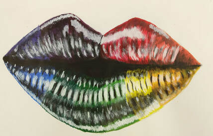
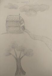
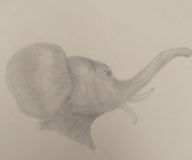
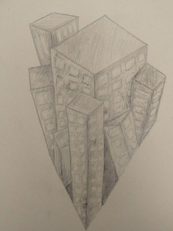
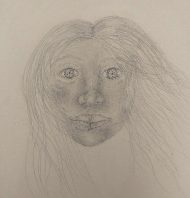
I had to draw a landscape, an animal, 3-point perspective, and a face. I drew these pictures from the top of my head to show where I stand in art. I used different values in shadings throughout my drawings.