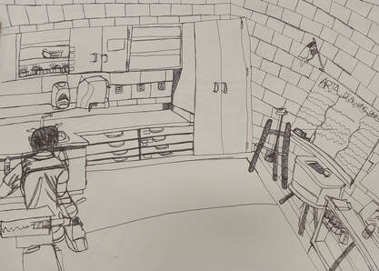
Contour Room Drawing:
1. Did you use a fluid line? Explain how is this evident?
I mostly used fluid line, in some area it is not as fluid as others. This is evident by the solid lines drawn onto the paper and not as thick. Fluid lines are also not lifted up from the paper.
2. Explain how your knowledge and creating practice studies with contour line contributed to the success of your piece.
Being able to do the practice studies helped my room contour drawing be successful. It helped me be successful by helping me get the feel with the pen by doing this technique. I could not lift up my pen while doing this project which was a little difficult.
3. Describe the difference in your contour line drawing to an outline drawing.
A contour line drawing is continuous and moving drawing. Contour drawings create dimension and somewhat value. While instead, an outline drawing is more of a solid line sketched online the silhouette of the object drawn.
4. Explain how your interpretation of line is essential in capturing the look of the room.
I think line is essential to capturing the look by showing the dimension of the room and making it not look so flat. Having the lines go in different directions shows the corner of the room and depth.
5. What did you learn from completing this drawing? If you could recreate your piece what would you do differently to enhance the final outcome?
I learned how to successfully draw a contour room drawing. It was a little bit intimidating at the beginning of starting this project but once I started it, I felt an easy feel with the pen by drawing it. If I could recreate this piece I would draw more slowly and take more time on it. I would also add more details in some of the areas in the room and show its texture.
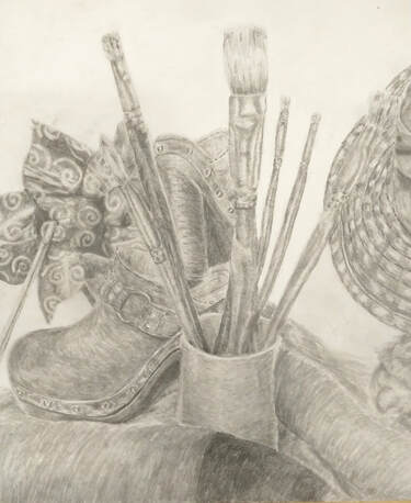
Still Life Drawing:
1. Describe the craftsmanship of your drawing. (Is it clear, clean edges, blended well, smudges, defined space, etc.)
My craftsmanship for this drawing is good. My drawing is clear, it is well blended, has the correct shading and has well defined space.
2. Are your values and shadows realistic? How many values did you include? How and why are values important?
My values and shadows are realistic. I could have shaded a little darker in some areas and added more value on the fabric to show the shadows and depth. I used all nine values in my piece. We use values to show the transitions in shading of where the light hits the object. Value is important because it helps show the drawing depth and make it look more realistic than flat.
3. Is there a clear source of lighting?
Yes, there is a clear is a clear source of light. I showed where the values changed throughout the piece and showed depth. I think I could have added a little more darks and lights in some areas to make it more defining.
4. How important were the compositional sketches? Explain.
The composition sketches are very important because it helps us get an idea of how we want our piece to look and gives us options to choose from the best one. We use them to show different arrangements of objects and different perspectives. It also is important because it helps us choose and make a more interesting piece.
5. How is your final drawing successful?
My final drawing is successful by having lots of value and showing the texture. With each object I started off with light layers and slowly built up making it darker, which helped create depth.
6. Are the proportions, structure and perspective of the subject correct?
My proportions, structure and perspective of the objects are correct. I showed the objects are bigger in the front and smaller in the back.
7. Does the placement and grouping of objects create a pleasing arrangement(composition)?
Yes the placement and grouping of objects creates a pleasing composition. I filled up a lot of the space in my piece and showed the proportions. In some areas I could have had another object to fill up the space.
8. Is there a center of interest and is it well located?
Yes there is a center of interest. Whenever I look at my composition my eye keeps going towards the pinwheel and the paintbrushes. It is well located and is on the left side of the piece.
9. How well did you manage your time and resources throughout the process of creating this drawing? Do you see where you could improve in this area?
I managed my time okay. I was a little distracted during class and didn't work as much on my piece. I wish we did have a little more time to work on this project in class. I can improve by staying motivated and staying focused on completing this project. Instead of talking to my peers I should have listened to my music and completed my piece.
10. What challenges did you encounter during this project and how did you overcome them?
Some challenges I encountered was trying to get the proportion right, showing the texture and showing the correct values in some areas. I overcame these obstacles by sketching and shading in layers till I got the correct values right. I also accomplished the textures by sketching lightly in the direction the object was going. Like I showed more texture in the bristles of the paint brushes, the cat and the hat.
11. What have you learned from drawing a still life?
I learned how to successfully show the texture in the metal of the paint brush and show the values making it look realistic. I also learned to show the values in the hat. I showed the dimensions and textures on the outside of the hat.
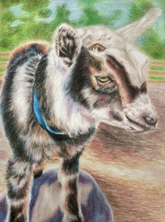
Look at that View:
1.Describe how you created an interesting point of view? Was it successful? Why or why not?
I created an interesting point of view by showing the goats head was bigger than its body and that the background was smaller than the goat. I showed these perspectives to show that the goat was closer to the person looking at it and that the background was farther away. I also showed that the view was looking a little bit down at the goat and not directly right in front of it. I think this piece was successful because I represented perspectives throughout the piece.
2. Why is it important to understand perspective and how to draw it?
It is important to understand perspective because without it your piece will look flat and have no dimensional. Perspective helps make a piece more interesting and shows where an object is in the piece. In my piece I drew this by drawing the goats head bigger than the body showing that it was closer to the person and the background was smaller showing that it was farther away. I also drew my goat looking down at my goat that just straight on its front.
3. How were the colored pencil exercises important in the success of your piece?
The colored pencil exercises were important to the success of my piece by practicing techniques on how to blend the colors and applying the shading down without too much pressure. It also helped me practice the texture of fur which I had to do in my piece of the goat.
4. Describe the craftsmanship of your colored pencil. What techniques were used?(How well the project is technically crafted).
My craftsmanship for this project was very good. I applied very light layers of colors before applying more pressure making the layers darker. I also included colors that you wouldn't normally see unless you looked close enough. I also blended the colors together along with applying texture to show the fur in the goat.
5. Were you able to achieve depth by showing a foreground, middle ground and background? Explain.
Yes I was able to achieve depth by showing a foreground, middle ground, and background. I achieved this by using my different perspectives and compositional sketches. I showed that the goat's head was a little bit bigger than its body and showed the background was smaller than the goat to show it was farther away.
6. Explain your experience with colored pencil and the project in general. What were the obstacles and advantages?
I have used colored pencils a lot. I have used them for the last couple of years and have gotten a hold on different techniques to use in different compositions. I am still learning new techniques every day or I am either getting reminded of what to do. I generally didn't have that many obstacles except for drawing the fur. In some areas I had to be care about blending, especially with the color white, and make sure I didn't over blend and lose the strokes of texture.
7. Looking back on the progression of this project what skills, techniques or other information would you like to have been taught? Do you feel you were prepared for this project?
I don't think there was anything else that needed to be taught except maybe as a class we could have gone over how to draw different textures. I definitely felt prepared for this project.
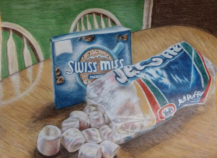
Opacity Project:
1. Describe the craftsmanship of your drawing. (Is it neat and well executed?)
My craftsmanship of this drawing is well executed. I showed the texture of the plastic and tried to show how it was see through. I also showed the texture in the marshmallows and brought some of the colors in the bag into the marshmallows to make it more realistic. I added lots of highlights to show the texture in the plastic bag and to show some of the creases.
2. Describe your choices of colors/color harmonies and how you used them throughout the artwork.
I chose to use mostly warm color harmonies throughout the piece and in some areas on the marshmallows
I added cool colors to add contrast and to show that the marshmallows were white and give it a cool feeling. I also pulled colors from the plastic bag and incorporated them into the marshmallows to make them more realistic.
3. How did you create contrast in your drawing?
I created contrast in my drawing by adding more color and pulling colors in the plastic bag into the marshmallows to make it more realistic. I also added complementary colors to the main colors in the piece. I added different color harmonies to create more contrast and to show the realistic values.
4. How did you use textures, highlights, and shadows to enhance your artwork?
I used textures by coloring in the direction of where the creases and shapes in the objects were going. I also colored in circle motions to make sure I got all the colors blended together.I also used highlights by adding lots of white colored pencils in the places where the light is hitting it the most. I also used white for the parts on the plastic to show that it was clear and give it some texture. I used shadows throughout my piece by using applying more pressure onto the paper and made the colors darker creating shadows and depth.
5. Why did you choose a particular background color to mount your artwork?
I chose this particular background color because it was contrast to the rest of my drawing and it was in my reference photo. Also in the background I added chairs behind the table to show the perspective and to show how the bag of marshmallows and hot chocolate box were closer to me.
6. Discuss the importance of understanding the media (prisma or pastels) and acquiring the skills necessary to create a successful project.
It is important to understand the skills to use prismacolors because if you don't use the techniques you won't acquire the understanding of what you learned and the final drawing won't look as realistic. To create a successful piece you have to apply light pressure with the pencils and build up layers with the colors. You also have to blend the colors in circle motions to help not show the harsh lines of color change.
7. Describe any difficulties you had creating your drawing and what you could do to improve your drawing?
Some of the difficulties I had when creating my drawing was showing the texture and contrast in the plastic bag and showing the texture with the marshmallows. I wanted to try and show that the marshmallows were more fluffy but I had trouble doing that so I just kept adding colors and values into the marshmallows to give it depth. With the plastic bag, it was a challenge to show that it was see through. I added the darks and details in the bag and used a white prismacolor over the bag and colored it in the direction the bag was going to give it texture.
Value Portraits Project:
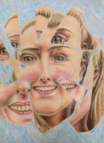
1. Explain the process you went through to develop your drawing.
The process I went through to developing my drawing was that I created four compositional sketches. Once I picked the sketch I liked I then did a final sketch with color and then I moved on to my final piece.I then created an outline for my face and used the eye outline to figure out where my facial features are placed. After I got an outline for my face I tested out different shades to see which colors matched my skin tone. Once I figured out the right shades I started coloring my face and did small areas at a time. I first colored my face and then did my facial features last.
2. Explain how you found the different values in the portrait?
I found the different values by using the prismacolor portrait set and tested the pencils on the back of the sheet to see which colors matched my skin tone. With faces in general there is a red tint because of the blood vessels. Some areas show more red tints than others, so I used a red colored pencil for my face. I also used dark umber pencils for the places that were more dark to show the shadows on my face and used white to show the highlights on my face. I also used sienna and yellow ochre in my hair to give it more contrast.
3. Did you achieve a full range of the different values within your portrait? How?
Yes I achieved a full range of the different values. I did this by using lights and darks throughout my piece to show the shadows and highlights in my face. I also used other colors that don't directly see to give my portrait more contrast and make it more realistic.
4. Describe your craftsmanship. Is the artwork executed and crafted neatly?
My craftsmanship for this project is well executed. I have accomplished drawing my facial features and skin tone correctly and still made it look like me. I worked in small areas on my face so I could get the right skin tone and to make my self portrait neatly.
5. How were you able to capture your look?
I was able to capture my look by working in small areas and by taking my time. I used various colors such as red, sienna, and yellow ochre to make my drawing more realistic and pulled colors into other areas. I took my time and continued looking back at my facial features to make it as realistic as possible.
6. Explain how you made sure you had correct facial feature placement.
I made sure I had the correct facial placement by outlining my face and then drawing a line vertical halfway down my face and then I drew another one horizontal halfway. After that on the line that was on the horizontal line I drew five outlined eyes across my eye and placed my eyes where they go. Then once I placed my eyes I placed my nose which was one and a half eyes down between my eyes. From half an eye down from the nose the mouth started and the mouth was one eye long. I then placed my ears which started from my eyes and ended at my nose. The last thing I placed was the eyebrows, which was one eye above from the eyes and was eye length long.
7. Explain the importance of learning how to draw all the features individually.
It was important to learning how to draw all the facial features individually because it helped us get a better understanding of the shading and highlights in each feature. Also practicing the facial features helped me get the feel of how the lips, eyes, nose and hair was structured. Doing these practice drawings helped me make this project more successful.
8. What part of this unit was the most beneficial and why?
The most beneficial part of this unit was doing the practice drawings of the facial features and make a rough sketch of where to place all the features. I have drawn a couple of portraits before but have always used a grid and so this placement technique really came in handy since I wasn't allowed to use a grid. I also have drawn facial features before and it was good to go over them again and watch the do's and don'ts on drawing the features. I learned that I have been doing some of the don'ts before doing this project and have drawn my best colored eyes and nose.
9. List any obstacles you had to overcome and how you dealt with them.
The obstacles that I had to overcome was time management, the size of my paper and drawing some of my facial features. Towards the end of the project I needed more time to work on it, so I had to make more time to work on it through the nights and on the weekend in order to get it done on time. I also had a hard time with the amount of drawing I had to get done because my paper was a bigger than my other peers. The main reason I chose this size was to try and challenge myself. The way my drawing was laid out I had lots of glass in the background so I cut my paper down. I also was a little nervous about drawing multiple eyes and mouths since it was in the shattered glass pieces. I was nervous that it wouldn't look similar to the other eyes and mouths but it turned out quite successful. I just took my time and didn't rush.
Scratchboard Project:
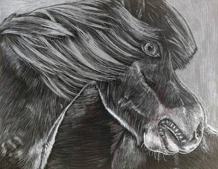
1. Describe the subject matter and meaning of your artwork.
I decided to draw a horse on the scratch board because it showed movement with the hair blowing slightly and the light hitting the horse. I chose this picture because it was one of the many pictures I took in Iceland which was a very special trip with my Dad. I was such an amazing place and the was so much movement and texture all around us. I also just love the way the horse it looking out into the field while the sun is hitting the horse's face and the shadows are underneath.
2. How did you use textures to enhance your piece?
I used textures to enhance my piece by drawing short, quick lines in the direction of where the fur was going. I also used a wide range of values with the fur to enhance my piece. I showed where the highlights and shadows were. I also used the hatching technique and drew lines close together for where the highlights were.
3. How did you balance your artwork and create a well-organized composition?
I balanced my artwork and created a well-organized composition including a wide range of values, showing texture and by taking my time with this project. In the top two corners was the sky and I made it all white to show that was where the light source was coming from. I then added a very thin black line in between the horse and the sky to not blend the values of the horses fur with the sky.
4. How did you imply movement in your drawing?
I implied movement in my drawing by showing the texture with the hair and the fur in the horse, the different value changes, and I showed that the hair was moving by the breeze. To help show movement I used light, quick, tiny strokes in the direction of where the fur and hair was going.
5. How could you improve your artwork?
I could improve this piece by spending more time on it because I kind of rushed through it but I also showed all the value changes and the correct textures. If I could go back to this piece I would add more values to the darks to show the texture. I would also like to redo the mouth. I didn't like the value changes and shadows in the mouth. I would spend more time on the mouth and take my time rather than rushing it.
6. How did you demonstrate a wide range of shading values?
I demonstrated a wide range of shading values by applying light pressure to get the darker values while applying harder pressure to get the lighter values. I showed a wide of values throughout my piece and included many highlights and shadows to show the values. I also used texture to help show the range of values.
